Front
Cover- We positioned our artist in the center of the shot with his
sight lines looking directly at the camera to gain a clear connection
between the artist and the audience. The inclusion of the acoustic
guitar is iconic for our genre and many fans would be disappointed if we didn't include it. Our artists dress code is conventional to our genre and
we decided to put a grainy effect to establish the outlines of the
wall, the guitar and our artist. It makes everything stand out much
more. We used a font so it looks like our artists name and album
name have just been scribbled up the side of the wall.

Back
Cover- We stuck with the same font for our song titles just not so bold
so it looks like our artists has just signed the album with his own
handwriting. The picture stays with convention with our artist busking, this shot contains the conventions that are expected in this
genre. The clothes and props used show the genre of the artist clearly.
We used a slight grainy blur effect to outline the importance of the
guitar and the statue. The setting maintains the image of him being from
a more rural area and boosts his star image of being brought up well.
We used a BlackBerry barcode to offer our fans an easy way to access
more information about our artist. We included our logo and company name
Phoenix Productions to show who the artist is signed by, this is key
for our record company. We included websites for our artist and this
allows fans to know where to access information about him. We also
included copyright laws in small print, to maintain that nobody else
is allowed to use this media image apart from Phoenix Productions and
the artist without consent.
After some audience feedback we
decided these images are really effective but don't provide the most
effective combination in conjunction with our video and our advert.
However these will probably be awesome in the second album! Our second go at an inlay will be posted next.
First
inlay- We decided to use a high angle shot to show our artists being
vulnerable and unaware of the photo being taken. The setting of the
peaceful lake matches the nice upmarket setting that the artist is
associated with. We used high-key lighting to enhance the colours in the
background. It shows a different angle of the artist for the audience,
as he's not performing and there's no guitar in show. This image focuses
more on the setting rather than the artist himself.
Second
Inlay- We used an over the shoulder shot to show him staring into the
lake and thinking about things as time passes. We stuck with a colour
photo to show off the different shade of colours which lay within the
lake. The main focus of this photo is again about the setting as we want
to show our audience that he is a peaceful individual, who likes to
spend time within nice surroundings.
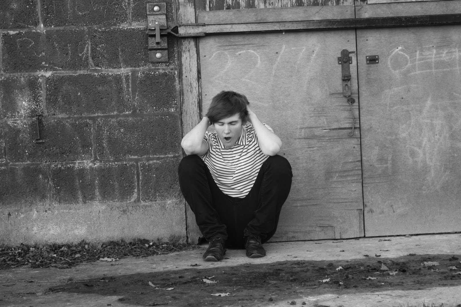
Third
Inlay- We decided to go for a black and white approach which we
included in our music video but instead of a flashback, this time we
used it to show him in rougher areas which relate more to similar
artists as many other indie acoustic artists and shown in rough area.
It's to show them coming from nothing and making it big. In this photo
it shows our artist struggeling and time passing which can link with our
video as it shows him wanting just to hold his girlfriend. His
expression that he is emphasising is quite a emotional shot and showing
him letting out pure emotion.

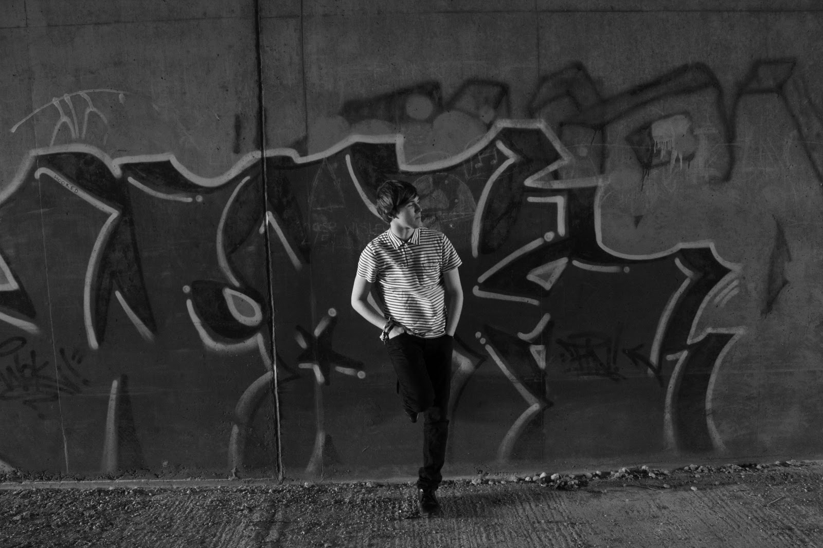
Our Final Inlay- This shot was taken inside a motorway bridge, the
inclusion of graffiti is a key convention that similar artists adopt and
use within many of their music videos, album covers and their adverts.
His is showing himself being relaxed and away from the world. The
clothes he is wearing convey a student image who is well educated and an
intelligent student who carrys a great passion for music. The
background is showing the complete opposite, it is showing a rough area
where traditionally less educated individuals come from.